
On 10 October a Lighthouse report for this site came back with 100 in every category. Performance, accessibility, best practices, SEO. On mobile, which is the hard one.
Before writing about it I ran it again. Every page, both languages, three times on mobile and three times on desktop. 114 runs. The score was not 100 everywhere. Three desktop pages lost points on layout shift, and so did two about pages on mobile. Every run showed the same shift.
What was moving
Cumulative Layout Shift measures how much visible content jumps after it first appears. Google calls anything under 0.1 good. The English services page scored 0.179 on desktop. Pricing 0.109. Lighthouse blamed the same thing every time: "Web font loaded".
The page first draws its text in a fallback font. When Instrument Sans arrives, the text is redrawn in it. If the two fonts take up different amounts of space, lines wrap differently and everything below them moves.
That is a known problem with a known fix. Font tools generate a fallback face from a font you already have, scaled with size-adjust and ascent-override to match the web font. The site uses @nuxt/fonts, which does this automatically. So I looked at what it had generated.
@font-face {
  font-family: "Instrument Sans Fallback: sans-serif";
  src: local("sans-serif");
  size-adjust: 100%;
  ...
}
local() takes the name of an installed font. "sans-serif" is not one. It is a generic family keyword, and inside local() it matches nothing. The face never applies, so the browser draws the text in system-ui at its own size, and the metrics nobody adjusted shift the page when the real font loads.
Why it picked a font that does not exist
Each family in the config had provider: 'google' on it. With a provider named per family, the module takes the fallback from what Google reports about the font. Google reports the category, sans-serif, and nothing else. The module's own default list, with Arial and Helvetica Neue in it, is never consulted.
The fix is a small change to the config. The provider moves to the top of the fonts block, and each family names a real fallback.
fonts: {
  provider: 'google',
  families: [
    { name: 'Instrument Sans', weights: [400, 500, 600, 700], fallbacks: ['Arial'] },
    ...
  ]
}
The generated face became local(Arial) with size-adjust: 102.7%. That fixed four of the five pages.
Close is not the same as equal
The fifth was the English services page. Its heading, "One platform, known inside out.", takes up 794 of the 877 pixels available in Instrument Sans. In the size-matched Arial it wraps to two lines, and the hero is 96 pixels taller until the real font arrives.
I measured every hero on the site in both fonts. Five pages change height, in both directions. The home page gets 68 pixels shorter in Arial, services gets 96 taller. A matched fallback matches on average. A large semibold heading with tight letter spacing is not average. Shortening one heading would only move the problem to the next page.
The fix that made the score worse
The obvious next step is to preload the font, so it arrives before the first paint and there is nothing to swap. I tried it. Layout shift went to zero.
Mobile LCP went from 1.4 seconds to 3.0, in all three runs.
The page itself was no slower. Chrome painted it in about 0.2 seconds both times. The difference is in how Lighthouse scores mobile. It does not run the page on a slow phone. It records a fast load and then simulates a slow one, and a request with high priority that starts before the first paint is counted as something the paint waits for. A preloaded font starts very early with high priority. So the simulated phone waited for 30 KB of font that the real page never waited for.
There was a smaller trap on the way. The module preloads the first file Google lists for the family. That was the latin-ext italic, which no heading on the site uses.
What shipped
font-display: optional on every face, and no preload. The browser uses the web font only if it is available within about 100 milliseconds. If it is not, that page view stays in the size-matched fallback and the next page has the font from cache. Nothing ever redraws, so nothing moves.
@nuxt/fonts has no setting for font-display. It writes swap. It does have a fonts:providers hook, so the config wraps the Google provider and marks every face it returns as optional.
The trade is honest: a first visit on a slow connection can show a page in Arial. Because the fallback is size-matched, it looks close.
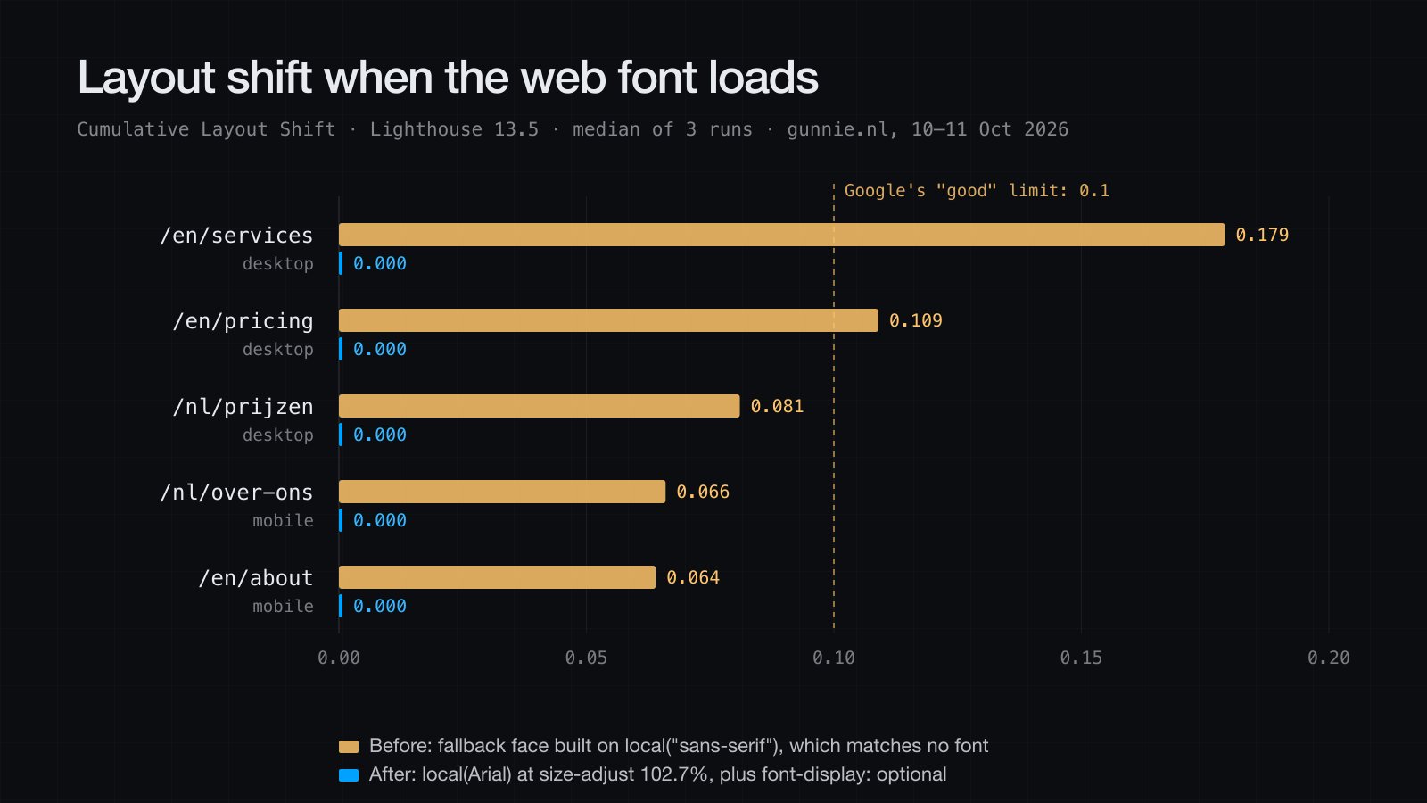
The numbers
Lighthouse 13.5 against production, 19 URLs, three runs each on mobile and on desktop.
Desktop pages at 100 in all three runs: 11 of 19 before, 16 of 19 after. The other three score 99 or 100.
Lowest desktop score: 91 before, 99 after.
Runs with visible layout shift (CLS above 0.01): 29 before, none after.
Worst layout shift: 0.180 before, 0.001 after.
Accessibility and SEO: 100 on every page.
Mobile is not 100 everywhere and I am not going to claim it is. The median is 99. The same page scores anywhere from 90 to 100 from one run to the next, and that follows server response time, not anything in the page. The single report that started this was a good run.
The browser panel or the npm package
Lighthouse comes in two forms that most people treat as the same tool. One is the Lighthouse tab in Chrome DevTools. The other is the npm package, which you run from a terminal. They share the scoring code. They do not share the conditions it runs under.
The DevTools panel runs inside the browser you are using. Your extensions are loaded, unless you test in an incognito window. Your other tabs, and DevTools itself, use the same CPU as the page under test. The Lighthouse version is whatever your Chrome release bundles, so it changes when Chrome updates.
The npm package starts its own Chrome with a fresh profile and no extensions, headless if you ask for it. You pick the version, so npx lighthouse@13.5.0 runs the same release next month as it does today. And it writes JSON, so it can loop.
for run in 1 2 3; do
  npx lighthouse@13.5.0 https://example.com \
    --output=json --output-path=run-$run.json \
    --chrome-flags="--headless=new"
done
That last part is what mattered here. The 114 runs behind this post came from the npm package. Nobody clicks "Analyze page load" 114 times.
Both default to the same simulated phone on the same simulated slow connection. So when the two disagree about a page, look at the environment before the method. The footer of every report says which one produced it, "with devtools" or "with cli", and which Lighthouse version. Check that before you compare two reports.
Use the panel to look at one page while you work on it. Use the package for any number you are going to repeat in public.
Check yours
Open your site, view the source, and search for Fallback. If you find a face built on local("sans-serif"), local("serif") or local("monospace") with size-adjust: 100%, it is doing nothing and your text jumps when the web font loads.
And run Lighthouse more than once before you believe it. One report is one sample.